Directed in 1995, David Fincher’s Se7en is a film that defies easy categorization. Perhaps too dark to qualify as a golden classic despite having all the right ingredients, neither is it a cult film in the traditional sense, as it is stocked with A-list talent and propped up by a smart script, a memorable score and rich cinematography, and a production value in lockstep with Fincher’s own vision for the film.
But few would question its merits as a cop drama, which as a genre trails right behind Westerns as films that Americans love to love but rarely support at the box office. Se7en beat those odds and enjoyed wide critical and popular success thanks in large part to a strong word of mouth around the film’s many hairpin turns, and one other thing: its title sequence.
The film doesn’t open directly with the sequence. It first introduces us to retiring Detective Sommerset (Morgan Freeman) and rookie replacement Detective Mills (Brad Pitt) as they also meet for the first time, establishing their combative on-screen chemistry and investing the audience in the evolution of their partnership. This prelude also introduces many of the key themes found in Se7en: hopelessness, apathy, desperation and – lest we wonder why – plenty of violence. By the end, we welcome Sommerset’s nighttime zen ritual of drowning out the chaos with a metronome on his nightstand, its hypnotic rhythm also asking for our trust and attention.
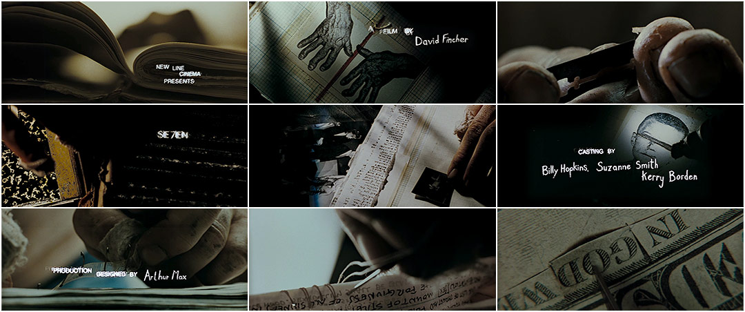
Instead, it delivers us into an even darker world, which – unlike the random city violence beneath Sommerset’s window – is obsessive, methodic, and purposeful. Directed by Kyle Cooper while at the newly-formed Los Angeles arm of titling giant R/Greenberg Associates, it’s a short story told in fragments and vignettes, following the hands of an unknown man – presumably the antagonist, John Doe – as he makes entries in his diary alongside clippings from books, self-developed photographs, and found images and objects, giving the audience an intimate look into the mind of a serial killer obsessed with religion and, more to the point, attrition.
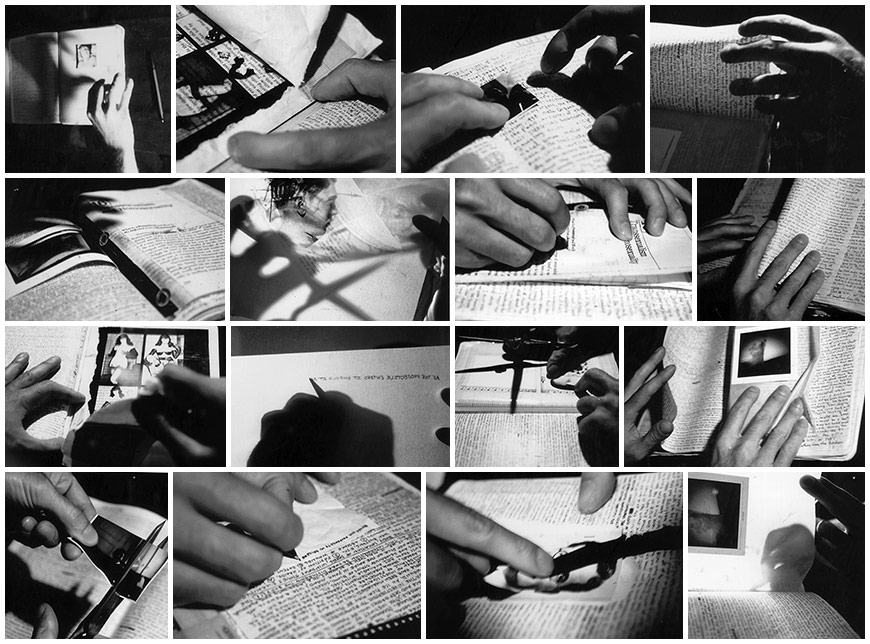 View 20 images
 Process photographs
It’s a sequence that has drawn comparisons to the grotesque photography of Joel-Peter Whitkin and the experimental self-aware filmmaking of Stan Brakhage, and its format has been likened to Stephen Frankfurt’s title design for Robert Mulligan’s 1963 adaptation of the courtroom thriller To Kill a Mockingbird, which also features close-up photography of personal items to describe the psyche of one of the film’s key players. But it is more likely a convergence of unique circumstances and artistic vision that gave the Se7en titles their own distinct cadence, blending Fincher’s treatment of the film itself with Cooper’s visual interpretation of its narrative.
And what ultimately distinguishes Se7en is its delivery, piecing together bits of leader and other film artifacts with ephemeral imagery and type etched right into the emulsion, all sewn together by Angus Wall’s staccato edit and Coil/Danny Hide’s nail-on-chalkboard remix of Trent Reznor’s industrial hit “Closer.” It’s an effortless presentation which – much like the killer’s diary featured within – wears its construction proudly on its sleeve.
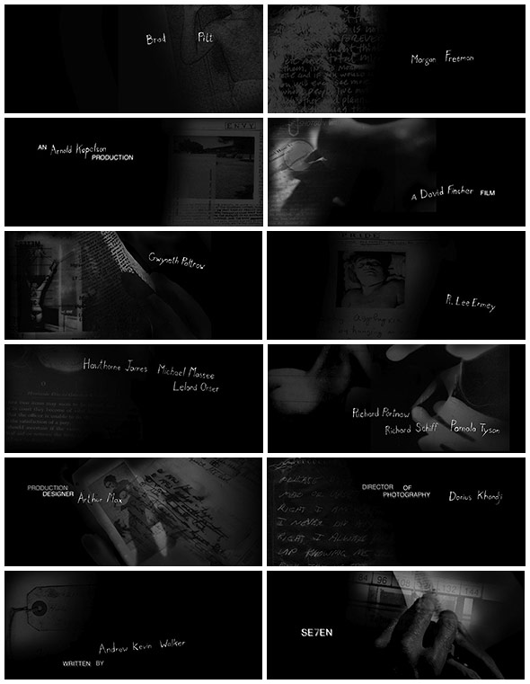 View 12 images
 Type + photograph comps
Fincher had originally considered director Mark Romanek for the title sequence, who had previously worked with Reznor on the music video for “Closer,” and with whom he shared similar aesthetic sensibilities. But Cooper felt an immediate connection with the material and pitched Fincher on an evolution of a technique he had used in several past title sequences. “I had done a lot of tabletop shoots – I had just shot money burning for Dead Presidents, and in fact, cutting “God” out of the dollar bill, I thought of that when I was looking at the dollar bill with the word “God” burning in it, and I was thinking about what John Doe might do.”
“When I was a kid and I would watch horror movies,” reflects Cooper, “the monster didn’t come out until the third act. I was lucky to watch [Se7en] early on, and I remember thinking that after I saw it, I wanted to see the killer earlier on… to somehow introduce the killer in the titles. I asked if I could look at all the props and anything that Fincher might have to look at, and there were a couple of prop notebooks that had excessive writing in them, and I thought it would be good to do a tabletop shoot with them and have it be about their preparation, as though it was John Doe’s job to prepare them.”
The notebooks themselves were created by designers Clive Piercy and John Sabel, who filled the pages with large blocks of text, broken only by the occasional macabre photograph or ambiguous artifact taped in place. “There was a whole shelf full of books, and probably six of them had content inside,” says Cooper, “and maybe two of them had a number of pages with excessive writing in them, with words like ‘lust’ and ‘greed’ – you know, John Doe’s notes – and so we used some of that production artwork, and some of them we just expounded on and made our own.”
“The Notebooks” featurette, with commentary by designers Clive Piercy and John Sabel
(From the 2010 Blu-ray)
Fincher had originally envisioned the sequence as a train ride from Sommerset’s suburban would-be retirement home back into the city, simultaneously creating a connection and a distance between the two locations. But when the suburban location was cut from the film, the focus instead turned to John Doe and his notebooks. “Once we talked about the idea of shooting his books, then I would meet with Fincher and he would come up with ideas of what to shoot, and I would come up with shots and we’d compare notes and start making storyboards.”
Cooper and his team at R/GA, including graphic designer Jenny Shainin, assembled a glorified slideshow of sorts, cutting photographs together with temporary title cards to convey the mood of the sequence. “We photographed books and shadows and mapped it all out with stills to get an idea of what it would look like when you see through the pages and you see the shadows behind the page and the backlight.”
This early sequence was further developed through storyboards by artist Wayne Coe, which were referenced during the live action shoot.
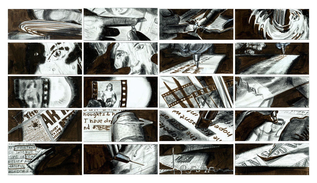 View 21 images
 Storyboard art by Wayne Coe
The typography itself – which would likely break several guild legibility rules in modern times – was hand-etched into black-surface scratchboard and manipulated during the film transfer process to further smear and jitter it. This transfer was then cut up and reassembled during post production to add a final layer of temporal distress.
“Fincher and I decided to use hand-drawn [type] mixed with Helvetica, and he was very excited by it,” says Cooper. “He knew that he wanted it to be drawn by hand, because it was from the mind of the killer, and I was taking that further, wanting it to be like the killer did the film opticals himself.”
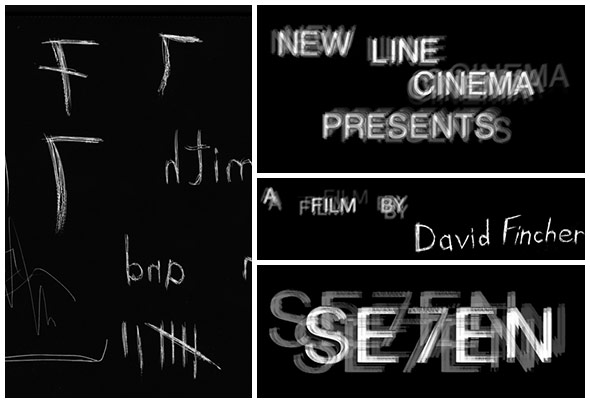 View 6 images
 This sentiment was not only reflected in the content of the sequence, but also in its assembly. Even though digital editing and compositing were already commonplace in Hollywood and especially in post-production, Cooper and his team opted to assemble the majority of the sequence by hand, giving it an analog warmth and randomness which may have otherwise been cheapened by digital effects.
“People think that there’s computer graphics in there, but having to deliver the thing as a traditional film optical and trying to encourage the guy working the optical printer to not throw away things that are accidents that we actually wanted in there, with fish hooks and razor blades going through the roll-up machine – it was just an interesting time,” reflects Cooper. “You can plan for everything and say we’re going to do something that looks effortless, but that’s not really realistic – it takes on a life of its own.”
Early storyboard edit, with commentary by title designer Kyle Cooper
(From the 2010 Blu-ray)
It is ironic, then, that the Se7en titles are often credited as the beginning of a new renaissance in title design defined in large part by – or at least enabled by – pixels and digits. And even more so given that its impact on the title industry is still felt almost two decades on, both as a legacy and in the countless knock-offs it has inspired over the years, having been co-opted almost wholesale by the horror genre as a house style.
In 2011, IFC ranked Se7en as the third greatest title sequence of all time, behind Richard Lester’s A Hard Day’s Night and Saul Bass’ Vertigo; the New York Times credited it as “…one of the most important design innovations of the 1990s.” But perhaps John Doe describes it best in his own words:
“Wanting people to listen, you can’t just tap them on the shoulder anymore. You have to hit them with a sledgehammer, and then you’ll notice you’ve got their strict attention.”
SUPPLEMENTAL: End credit crawl


